If you’ve ever found yourself squinting, tapping, or rage-clicking at a minuscule “X” on a mobile ad, this one’s for you. A clever side-by-side meme has gone viral for a reason: it compares the relative size of the planet Mercury against the massive Sun with the equally tiny “close ad” button on a smartphone screen against a human fingertip. The result? A hilariously relatable visual that’s both astronomically accurate and painfully familiar.
Let’s unpack the humor, the science, and the digital design flaws that make this meme hit home for all of us.
Why This Meme Works So Well
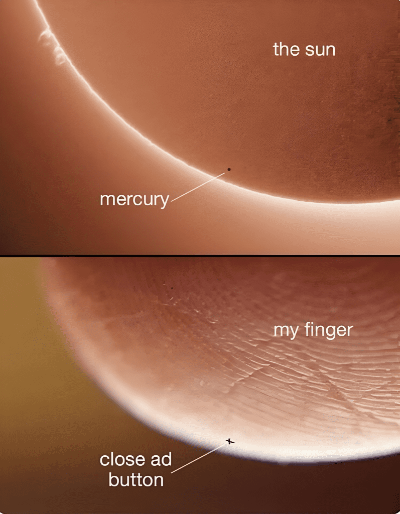
In the top image, we see a real astronomical event: the tiny dot that is Mercury passing across the blazing face of the Sun. It’s a beautiful reminder of the scale of our universe. But in the bottom image? That’s where the comedy gold kicks in.
It zooms in on a fingertip—textured, massive, looming—and right next to it is a barely visible “X” representing the “close ad” button we all know and despise. The caption reads: “close ad button”, mimicking the Mercury-Sun comparison.
What makes this meme brilliant is how it exaggerates the frustration we’ve all felt trying to hit a pixel-sized target on a phone screen. And let’s be honest—it’s not an exaggeration. Sometimes, those buttons really are that small.
The Daily Battle With the Close Ad Button
Let’s paint the scene.
You’re reading an article or playing a game when—bam!—a full-screen ad appears. You look for the escape hatch. There it is, a tiny “X” in the corner. You reach for it with the precision of a brain surgeon. But your thumb taps… somewhere else. The ad expands. Now you’re redirected to another page. Now you’ve lost the article, the game, and probably your patience.
It’s a frustrating experience, and it’s far too common.
Why Are Close Ad Buttons So Small (and Hard to Hit)?
Let’s get real for a moment. It’s not just bad design—it’s often intentional.
Some mobile ads are designed with near-invisible “X” buttons to trick you into clicking the ad instead. It’s called dark pattern design, and it’s one of the more sneaky tactics in the digital advertising world.
Video : meme Of The day
These microscopic close buttons are:
- Placed at the edge of the screen, sometimes under the notification bar
- Transparent or low contrast against the background
- Designed to move or fade when you hover near them
- Intentionally too small for the average fingertip
In short, it’s not you—it’s the system. The meme captures that frustration in one powerful, humorous comparison.
The Real-World Scale: Mercury vs. the Sun
Now let’s switch gears for a second and appreciate the astronomical side of this meme.
- Mercury’s diameter: about 4,880 kilometers
- Sun’s diameter: about 1.39 million kilometers
That means you could line up nearly 285 Mercuries across the face of the Sun. The scale is mind-blowing—and yet it’s exactly what makes the meme so relatable. Just as Mercury looks like a speck against the Sun, the “X” looks like a meaningless dot on your screen.
Science meets satire, and it works perfectly.
User Interface Design Needs a Wake-Up Call
This meme isn’t just funny—it’s a subtle callout to app developers and advertisers. It says: “Hey, maybe make the close button big enough to tap without launching an accidental YouTube video.”
In a well-designed app, accessibility matters. That includes:
- Proper button sizing: Apple’s Human Interface Guidelines recommend a minimum tap target of 44×44 pixels
- High contrast: So users with visual impairments can easily see actionable buttons
- Logical placement: Not hiding the “X” in impossible corners or under the user’s finger
When designers respect the user experience, engagement improves. When they don’t? People create memes like this.
The Emotional Side of Tap Rage
There’s a term floating around—“tap rage”—and yes, it’s a thing. That moment when you’re trying to close a popup for the third time and instead get redirected? That’s digital betrayal. It’s why memes like this resonate so deeply. They let us laugh at the ridiculousness of modern tech frustrations while also validating the very real irritation behind them.
We don’t need more pixels. We need better priorities in mobile UX.
Video : Universe Size Comparison
From Laughs to Lessons: What This Meme Reminds Us
This meme is more than just a chuckle—it’s a smart piece of social commentary.
- It speaks to how frustrating small design flaws can become
- It reminds us that humor is a powerful way to share our digital pain
- It highlights how visual comparisons make abstract frustrations feel very real
Whether you’re a developer, a designer, or just someone who’s had one too many accidental app store redirects, this image hits where it hurts—and heals with humor.
Conclusion: From Mercury to Mobile, It’s the Little Things That Matter
At the end of the day, whether you’re gazing at the stars or tapping through an app, perspective is everything. This meme draws a line—hilarious and honest—between the scale of the universe and the daily minutiae of life in a digital world.
The takeaway? If you’ve ever missed the “close ad” button three times in a row, you’re not alone. You’re part of a global audience that knows the pain. And luckily, we’ve got memes like this to remind us that sometimes, the best way to deal with the small stuff is to laugh at just how massive it feels.