Every logo tells a story. Some brands use their logos to share powerful messages or embody core values, while others add hidden elements or symbols that subtly influence our perceptions. From well-known corporations to trendy startups, many logos contain clever secrets that spark curiosity and add depth to the brand. Let’s uncover the hidden meanings behind some of the most iconic logos you encounter daily—you’ll never look at them the same way again!
1. The Amazon App Icon and Aang from Avatar: Surprising Similarities
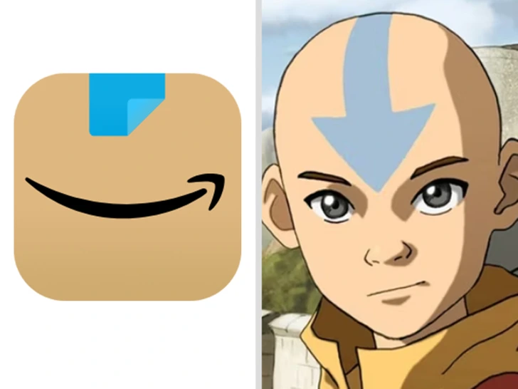
You probably recognize the Amazon app icon—the orange arrow curving into a smile. But look a little closer, and you might notice it shares some visual similarities with Aang from Avatar: The Last Airbender. Both use minimalist designs with bold lines and have strikingly similar orange or tan color palettes.
Amazon’s curved arrow resembles a smile that stretches from A to Z, symbolizing the vast range of products on offer. In contrast, Aang’s iconic blue arrow symbolizes airbending, his powers, and his path. Both designs rely on clean shapes and distinctive features at the top, making them instantly recognizable. This parallel speaks to the universality of simple, memorable designs—sometimes, they even cross the boundaries between worlds!
2. The Face on the Uncle Ben’s Logo: Meet Frank Brown
Since its debut in 1943, the Uncle Ben’s rice brand has featured a photograph of an elderly man in a bow tie. But who is this distinguished gentleman? Rumor has it that he’s based on Frank Brown, a Chicago maître d’hôtel who became a symbol for the brand after being spotted by the company’s owners at a hotel.
The choice to use Brown’s face was intentional—his kind expression and bow tie conveyed a sense of warmth and tradition, aligning with the brand’s down-to-earth values. For decades, he’s been the friendly face associated with quality and trust, reminding customers that Uncle Ben’s brings a taste of home to every meal.
3. The Tesla “T”: An IUD or a Cat’s Nose?
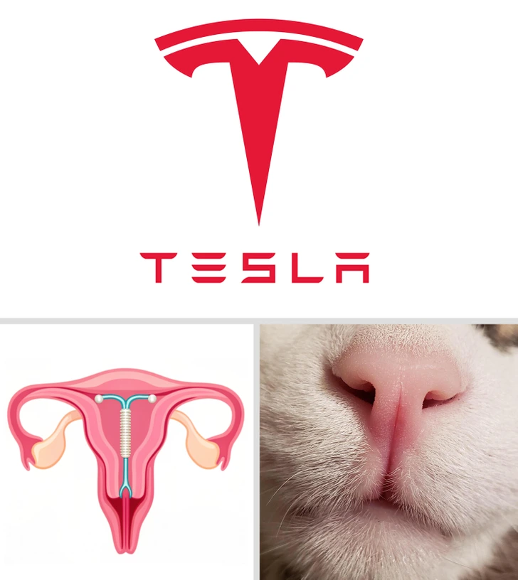
Tesla’s sleek “T” logo may initially appear straightforward, but it’s sparked more than a few debates. The “T” design is often interpreted as a reference to the electric motor, with the central bar representing a stator and the top line symbolizing a rotor. However, some viewers have noted a resemblance to a different T-shaped item: an intrauterine device (IUD), a common form of birth control.
Others say it looks like a cat’s nose, with the rounded top and two slanted lines resembling nostrils. This simple yet ambiguous logo invites interpretation, allowing Tesla fans and casual observers to see what they wish, which keeps people talking about the brand.
4. Hershey’s Kisses: The Sweetest Hidden Icon
The Hershey’s Kisses logo hides a sweet surprise—literally. When you look at the brand’s logo, you’ll see the word “Kisses” written in all caps, with a small Hershey’s Kiss embedded in the negative space between the “K” and “I.” This clever design element hints at the chocolate treats hidden within, subtly reinforcing the association between the logo and the delicious product it represents.
This hidden chocolate piece isn’t just a design quirk—it’s a clever reminder that sometimes the sweetest things are hidden in plain sight!
5. The Quiksilver Logo: Inspired by a Famous Painting
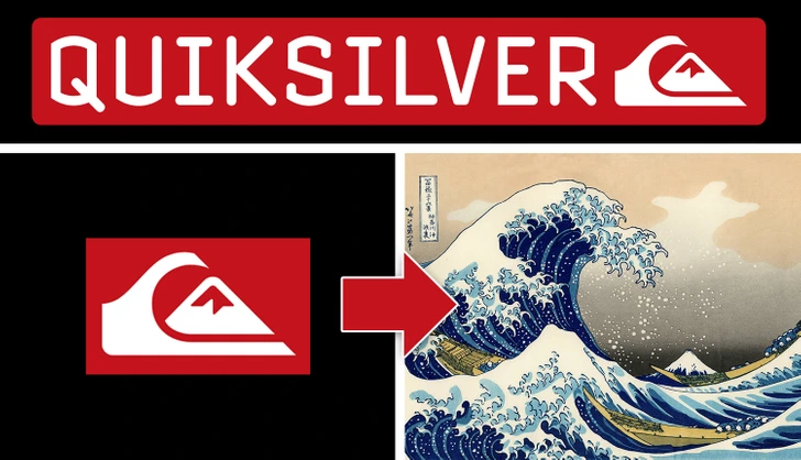
Quiksilver, the popular surf and snowboarding brand, has a logo with deep roots in art history. In 1973, founders Alan Green and John Law created a logo based on the iconic woodcut The Great Wave off Kanagawa by Japanese artist Katsushika Hokusai.
The design features a wave breaking over a mountain, symbolizing both the power of nature and the brand’s dedication to adventure. It’s a fitting choice for a brand that caters to thrill-seekers who live for the rush of riding waves or shredding snow-covered peaks. By referencing Hokusai’s artwork, Quiksilver brings a timeless, global element into its identity, paying homage to the heritage of surfing and its cultural connections.
6. Versace’s Medusa: Captivating and Timeless
Gianni Versace selected the mythological figure Medusa as the symbol for his luxury fashion brand in 1987. In Greek mythology, Medusa was so beautiful that people couldn’t resist her gaze, which ultimately turned them to stone. Versace chose this logo hoping to evoke that sense of allure and enchantment, capturing his audience with designs that are both luxurious and irresistible. Medusa’s presence in the Versace logo lends a sense of mystery and timeless elegance, aligning perfectly with the brand’s identity.
7. Disney’s Castle and Tinker Bell’s Magic Touch
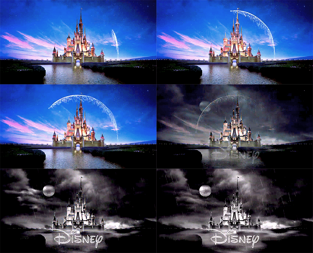
The Disney logo, featuring a majestic castle, is inspired by the Neuschwanstein Castle in Bavaria, Germany—a structure known for its fairy-tale architecture. This enchanting image immediately evokes a sense of wonder and adventure. But Disney’s castle also features an arc across it that many assume is a falling star. In fact, it’s Tinker Bell from Peter Pan, flying across the screen and leaving a trail of pixie dust. This charming detail reminds audiences of the magic in every Disney movie, creating a visual link to the world of fantasy that the brand represents.
8. The Laughing Cow and the Droste Effect
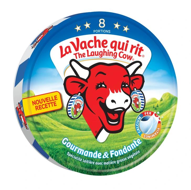
The Laughing Cow logo cleverly incorporates the Droste effect, a technique where an image contains a smaller version of itself. The logo features a cheerful cow wearing earrings that depict a miniature version of the same cow. This creates an infinite loop of smiling cows, making the logo both unique and playful. The Droste effect reinforces the idea that the brand brings joy to the table—a never-ending source of happiness and laughter.
9. NASA’s “Meatball” Logo: A Journey Beyond Earth
NASA’s logo, affectionately called the “meatball,” is packed with symbolism. The circular blue background represents our planet, while the stars symbolize space exploration. A red chevron or “wing” signifies aeronautics, and an orbiting spacecraft represents the journey into the cosmos. Designed in 1959 by NASA employee James Modarelli, the logo captures the agency’s mission and spirit of discovery, merging Earthly elements with cosmic ambitions.
10. LUKOIL and the Secret Message in Its Name
The LUKOIL name hides a reference to three oil-producing cities in Russia: Langepas, Uray, and Kogalym. The acronym pays homage to the company’s roots while also grounding its identity in the locations where it operates. This subtle nod to its origins highlights LUKOIL’s connection to the oil industry and to the communities that make its work possible. The logo’s clean and simple design underscores the brand’s focus on progress and innovation.
Conclusion: Seeing Logos in a New Light
The next time you see these logos, take a moment to appreciate the artistry and thought behind them. Each one contains a layer of meaning that deepens its connection to the brand, capturing our curiosity and stirring our imaginations. From subtle nods to mythology and art to hidden treats and playful illusions, these logos show that there’s always more than meets the eye. So, keep an eye out for the hidden stories—they might just change the way you see the world around you.


